Guide · Layer 4
Picking the Form
Written for: seed / Series A scientist-founder
4.4 defined what the figure has to show and made sure the comparison is fair. Now pick the form that makes the answer easiest to see.
You don’t need a catalogue of chart types in your head. Start from the question the reader needs answered, then check where the points came from — separate pieces of evidence and repeated runs of one model look nearly identical in a spreadsheet and call for different figures.
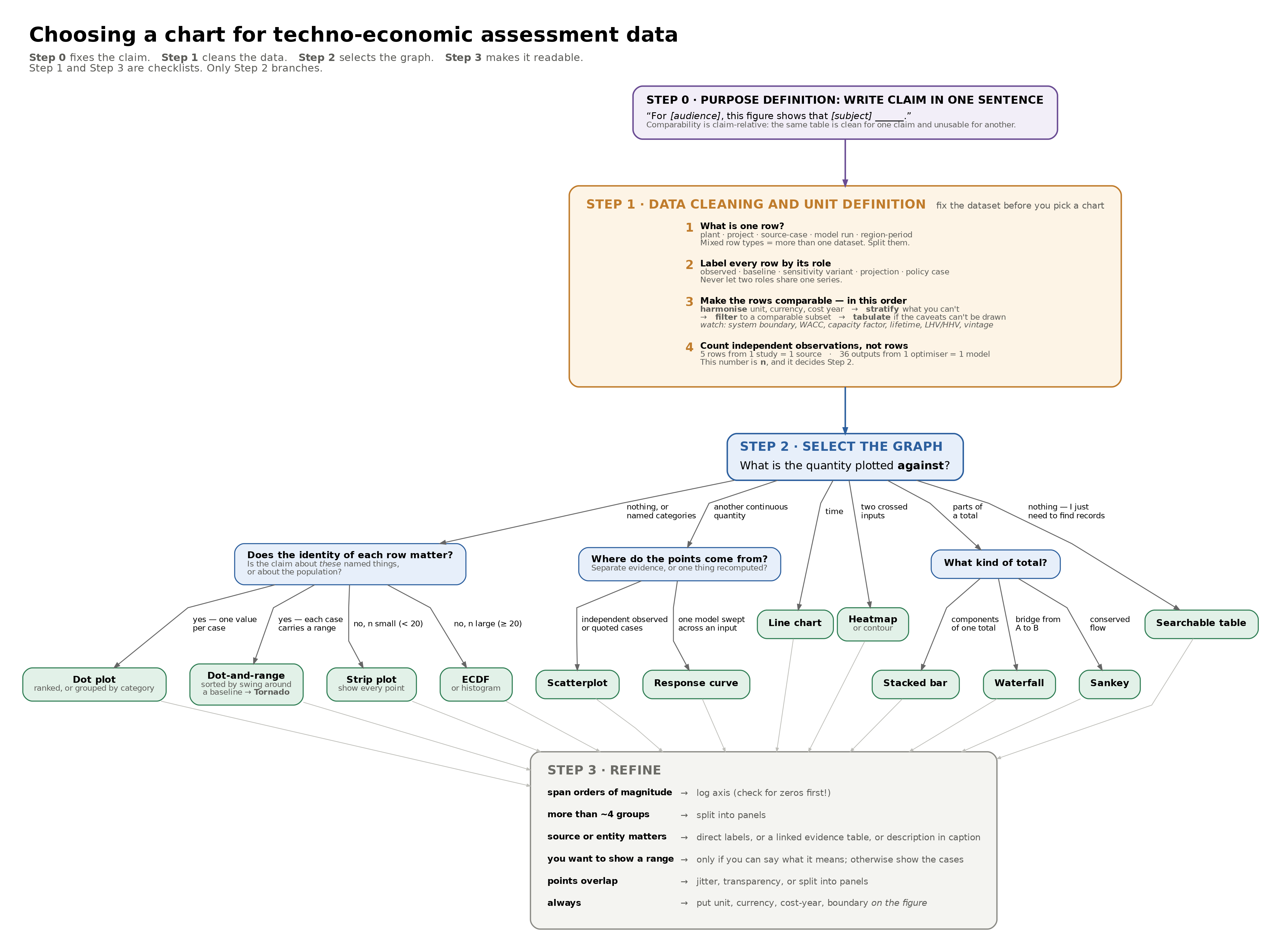
Compare a few named cases
Keep every case identifiable. If the claim is about these routes, suppliers, or scenarios, the reader needs to know which is which.
- One value per case — dot plot
- Low, base, and high per case — dot-and-range plot
A dot plot keeps the comparison direct. Add ranges only where they have a defined meaning, and label what the range is — a ±30% estimate class and a statistical interval look the same on the page.
Describe a set of observations
Use this branch when the individual names matter less than the overall spread.
- A small number of observations — show every point
- A larger set — ECDF
- A large, stable distribution — histogram
An ECDF keeps working as the dataset grows and doesn’t depend on arbitrary bins. A histogram is reasonable only when changing the bin width doesn’t substantially change the story.
See whether observed quantities move together
Scatterplot, one point per independent case: one plant, project, vendor quote, or country-year. Does specific capex decline with plant scale? Capacity on one axis, specific capex on the other, one point per comparable project.
Don’t connect the points unless they have a real sequence. Separate projects are observations, not steps along one curve.
Show how the model responds
Here the points come from repeated runs of the same model rather than separate pieces of evidence — which is exactly the distinction that decides the form.
- One input across a range — response curve. Sweep the input, record the output, connect the runs. Loose dots would make model runs look like independent findings.
- Many inputs, varied one at a time — tornado chart. Ranks inputs by how far each credible range moves the result; reach for it when the question is which assumptions matter most.
- Two inputs varied together — heatmap or contour. A heatmap shows how the outcome changes across the whole grid; a contour is better when the location of a threshold is the main result. At what combinations of power price and capacity factor does the route beat the incumbent? The break-even contour is the answer — this is the bivariate sweep from 4.2, given a form.
Show change over time
Line chart, when the ordering through time is what matters. Keep observed history and projections visually distinct — a solid line for history and a dashed continuation for projections is usually enough. Don’t connect years that are really a set of unrelated scenarios rather than a genuine time series.
Show what a total is made of
Three questions, three different forms.
- Compare composition across cases — stacked bar. How capital, fixed opex, and variable opex contribute across routes or scenarios. Keep the component order consistent so cases are easy to scan.
- Show how one total is built — waterfall. Purchased equipment up to total installed capital; gross cost to net cost after credits; the incumbent’s cost bridged to yours.
- Follow quantities through a system — Sankey. Material or energy flows: feedstock into product and losses, energy into individual unit operations. The widths have to represent quantity. If the goal is equipment and sequence rather than magnitude, the process-flow diagram from Layer 1 is the right form.
Keep exact values and assumptions
Table. A chart shows a pattern; a table preserves detail. Source, cost year, scale, system boundary, and exact assumptions often belong in a table even when the main result is shown as a chart. Often the honest answer is both: a chart for the conclusion, a table for the basis.
🧭 Coach’s Read
Let the question choose the form, not the columns you happen to have. Similar- looking data can require completely different figures: separate projects belong in a scatterplot, repeated runs of one model belong on a response curve, and the difference is what the points are — not how they’re shaped in the sheet. The most common damage is a line drawn through independent points, which invents a trajectory the evidence never contained. And no form rescues an unfair comparison: pooling cases that differ in system boundary, cost year, or scale gives you a clean-looking figure that answers no question at all. That check belongs upstream, in 4.4.
Once the form is settled, Layer 5 takes over: which figures earn a place on the dashboard, and which carry the argument in the deck.